
THE DOW OF 1995 IS PROVIDING A PERFECT ROADMAP FOR THE REST OF 2013

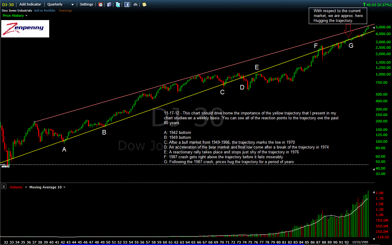
Over the past couple years, I have presented numerous bullish studies that have pointed to a rally that is on par with what we saw during 1982-1987 and 1995-2000. Both of these were 5 year rallies that presented significant technical clues as they were getting started. The technical clues were focused around trajectory points. For those of you who have been following along for the past few years, trajectory points along with volume are the only technical tools I use to gauge price. Simply put, a trajectory point is a means of gaining perspective into price.
There was a scene in the movie "The Aviator" where Howard Hughes was making "Hell's Angels." During the initial filming he was disturbed by the fact that the planes looked like they were moving slowly or not at all against a clear sky. It was only when he filmed the scene against a backdrop of clouds that viewers were able gauge how quickly the planes were actually maneuvering. Trajectory points are essentially the clouds that allow market observers to gauge how quickly the market is moving. Without them you have no reference point from which to measure movement.
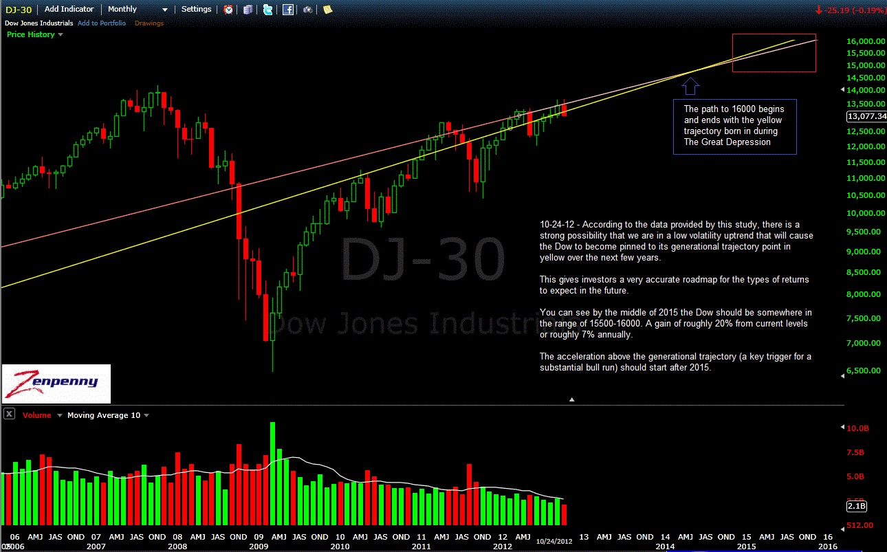
Where I was incorrect in the past study of the 1987-1995 market was where the market was in relation to breaking away from the trajectory. When I posted this chart in October 2012, I was expecting the market to begin accelerating away from its key trajectory point in 2015 based on where the Dow was relative to the 1987-1995 roadmap. Instead, it started its acceleration this year.
What I think is important to pay attention to at present is the behavior of the Dow as it pulled away from its trajectory point in 1995. This is the exact same trajectory we are pulling away from at present. I am posting monthly charts to give a clearer picture of what has occurred as well as what to expect.
The first chart is a long-term view of the trajectory point dating back to 1995 for reference:
click chart to enlarge

DOW 1995-2013
The second chart is the 90s Dow versus the current Dow as they accelerate away from the same trajectory after hugging it in the previous years. Many striking similarities as noted in the chart:

DOW COMPARISON